“Who is Deluxe?”-
Validating the Designs
Deluxe is a fortune 500 company that is well-known for their check ordering services. As of recently, the company has been rebranding. The company has been striving to not just offer check services but also provide payment, data, and marketing solutions as well.

The Challenge.
As a part of the rebrand, 2 user tests were already facilitated to ensure an understanding of Deluxe’s brand through the navigation experience. As we progressed further into the redesign process, we were challenged with a full web page redesign. This would validate our design decisions for Deluxe, who wanted to present themselves as a company that offers check, payment, data, and marketing solutions.
My Role.
I was responsible for the following
-
Facilitated user testing for the newly designed web page experience
-
Synthesized findings and allocated takeaways based off of the user testing
-
Presented findings to the stakeholder.
I worked as a UX Researcher with a Lead UX Designer, a UI Designer, a product Manager, and Creative Director.

Constraints.
Some of the constraints included the following.
Understanding the Client Culture:
Deluxe’s creative team were nit-picky and literal. We had to figure out ways to align with their perception of our testings and findings while convincing them to find importance in user testing.
Tight Turnaround period:
Since Deluxe had planned to develop the entire website experience in under 2 months, we had a tight turnaround for delivering findings for a user test. The test would also required extensive research and planning. We had a little under a week to perform user testing, allocate findings and present them to the client
Revisions:
While performing user testing during tight turnaround, the Deluxe team was in the process of giving revisions for the re-designed web pages. This meant working in parallel to the lead UI designer handling the revisions, and ensuring both of our teams were aligned on what the final prototypes for testing would be.
Process.
The process for the navigation experience redesign was as followed:
Plan
Our UX and UI Lead created initial wireframes and UI's of the webpage designs.
Execution
I lead and proctored the user testing through note taking and synthesizing.
Synthsize
I synthesized and delivered findings and framed that as Key Takeaways for the Deluxe team.
Plan
The pages that were were to be tested were newly designed page templates of the following:
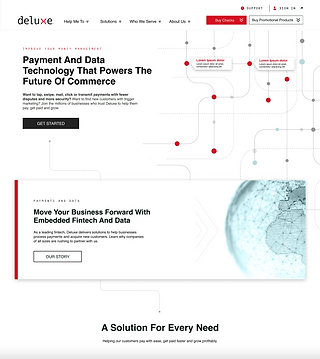
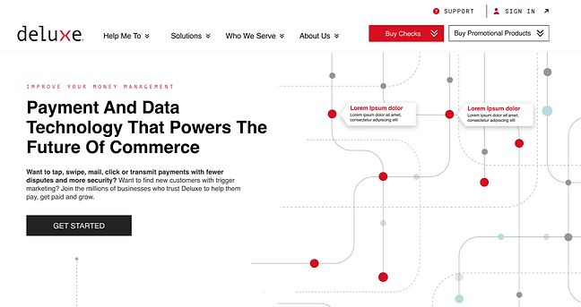
The Homepage
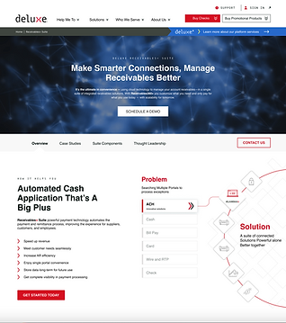
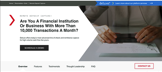
The Receivables Suite page (showcasing a new bundle of services that are offered within the Deluxe brand)

The Product page
(showcasing one of their new products under the receivables suite, remote deposit capture+)
Things to Keep in Mind,
When planning our test layout, there were a few key elements to keep in mind:
First, we wanted to execute this test as an executive, broad study that would overall help with validating our designs. This meant that we wanted to ask questions that were general to the aesthetics, interactions, and overall navigation of the website.
I felt that facilitating moderated user testing would be the best approach. Again, since we wanted general feedback on the overall flow of the design, we wanted to make sure our users were as descriptive as possible, prying into their rationale behind how certain design decisions made them feel.
Execution

We screened for users that were:
-
Us Residents
-
Ages 25-26
-
Minimum college education
-
Had relevant career fields in Business and Financial Operations Occupations and Management Occupations
-
Only mid-large size employers making an average of 50 mil in revenue.
* After thorough discussion with the Deluxe team, we decided to omit the human resources occupations from the screening due to the nature of our audience. Deluxe also wanted us to focus more on catering to larger audiences. Therefore, we put in screener questions for large to mid-large size businesses as well.
The Screening
The Goals
The goals were as followed:
-
Overall brand impression: How these designs represent Deluxe a company in terms of aesthetic , messaging, representation of Deluxe’s offerings.
-
Comprehensibility: do users understand what Deluxe, their receivables suite and product page can do?
-
Navigation & affordance: do users form accurate expectations for links and interactions throughout the pages tested
-
Content Flow & Hierarchy: Are components receiving proper emphasis from the design?
Structure
We also developed a structure for how we wanted to approach the test:
-
Initial impressions & understanding of the page purpose (what the company was offering)
-
Feedback on page content (most & least valuable components, questions, or critiques)
-
Follow-ups on specific interactions within these web pages.
Deluxe+, A New Change
As stated before, Some of the initial challenges we faced were presenting the test plan layout in parallel with new revisions being made on the Deluxe web page design. This was due to the tight deadline for the website development.
When presenting the test plan to the Deluxe team there were some changes that were requested.
The Deluxe team wanted to start incorporating their new brand into the company, Deluxe+. As a way to start promoting their latest rebranding, Dlx’s team wanted to utilize different design elements to translate the rebrand. With that in mind, our creative team worked hard to incorporate a Deluxe+ logo along with color exploration on both the receivables suite and product pages. From here, the Dlx team then requested to incorporate questions into the testing plan relevant to the Dlx+ rebrand.
Synthesize
Finding "Takeaways"
Findings for this user testing was quite interesting, as a lot of the information I discovered was more or less takeaways from the testing rather than finite design recommendations.
Therefore, it was in our best interest to frame the findings we discovered as takeaways rather than strong design changes. We decided to frame the findings as such due to the nature of the Deluxe team. We wanted to encourage their team that any observations we had were takeaways for us to consider within the future design process. We acknowledged that this user test was a broad and executive study used to get mostly general feedback and that this would be a collaborative effort to address any takeaways with Dlx and our team.
With that stated, here were some of the findings:
Overall Positive Feedback
All users understood that Deluxe offered financial services or payment solutions of some sort.
Because of our efforts with qualitative testing on the navigation, users could appreciate how users friendly and aesthetic driven the navigation was.
2 users stated that they would even look through the entire navigation to further explore the Deluxe brand before exploring the entirety of the page: which is good.
Users also stated how they liked the level of Interactivity and motion within the 3 web pages, they found the level of interactivity to be very eye catching and modern.
Users understood the page purpose and relationship between each of the pages.


Homepage
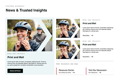
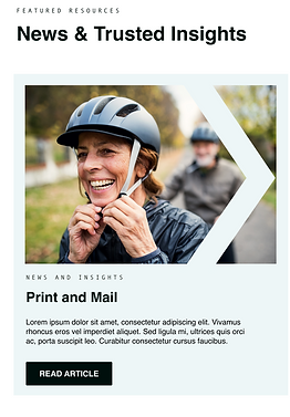
Overall good impressions with an introduct to who Deluxe is as a brand. News and Trusted Insights section could be addressed with more individuality.
3 users claimed that this was the least important section on the homepage, but still provides value.
Key Takeaways:
We wanted to consider forms of clarity and authenticity to this section with individuality to validate its importance on the page.
Receivables Suite Page
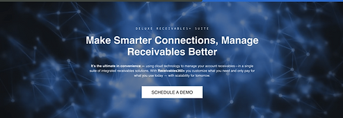
There were mixed reviews upon first impressions of the receivables suite page.
A few users had mixed reviews on the hero background visual. 3 users did not appreciate the aesthetic and color change on the receivables page.
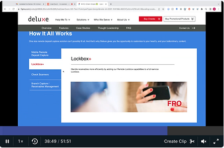
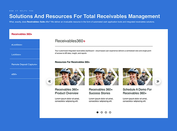
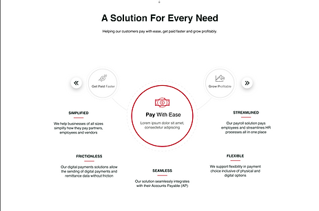
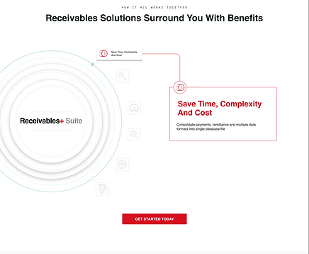
Some users found the elements in "How it helps you section" and "How it all works together" section were too busy.
Key Takeaways:
-
Since there were mixed reviews on hero background visual, we wanted to acknowledge it’s impact there could be further exploration on how to illustrate the receivables suite and its services.
-
Consider the amount of formatting within the links within the 'how it helps you" section.
-
For the "How it all works together" interaction, the header and hover copy may be lengthy and illegible, there should be consideration in shortening header copy and deciphering a necessity for the hover state copy. Also consider the vertical height in terms of browser size and usability.


Product Page
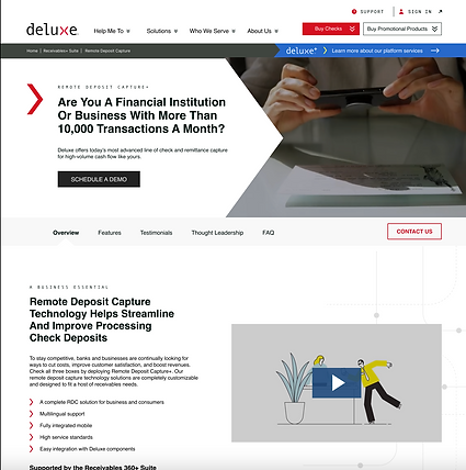
There were great first impressions of the product page. Users appreciated the video visuals a bit more on this page than receivables. Users felt that this video aligned more with the purpose of the page
Users understood what the Remote Deposit Capture+ service offering was. There was also an appreciation towards the benefits section within the page.
A Comparison
Through our findings we discovered that the structure of the product page was well received while the receivables suite page had mixed reviews. Users felt that the interactive elements (such as video content on the product page) aligned more with the branding elements of the product page than that of the receivables suite. Overall, we wanted to ensure that the interactive elements provided clarity on the receivables and product page for what services Deluxe offers.
There was mixed feedback on the hero background visual. While some users liked the approach, others found the interaction to be distracting.
Some users stated that certain content within the interaction such as the use of acronyms, caused confusion.
Receivables Suite page

Product page

Users appreciated the video content on the product page. It gave a clear explanation what the product offering was.
Additional Concerns
While covering specific findings from the web pages, there were additional that covered the entirety of the webpages' experience. Those concerns were the following:
Copy Clarity
There were concerns with how we handled certain terms such as Fintech, ACH, and 3T.
Key Takeaways:
In the future when presenting content to users, avoiding any complex terminology and jargon used.


Usability Concern:
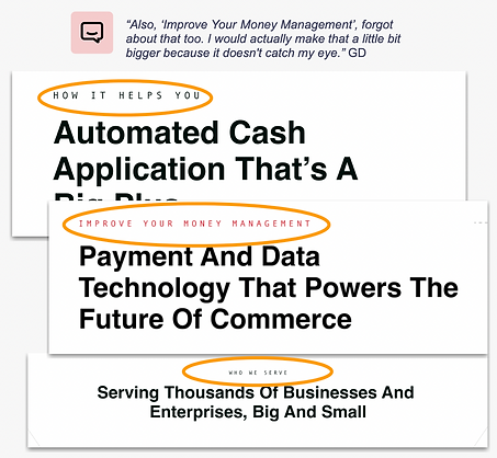
Font Sizing
Users felt like the eyebrow copy above the header section was unreadable.
Key Takeaways:
Explore different font sizing options with the eyebrow header copy. Ultimately, to ensure that users are digesting all of the header content on these pages.
Page Aesthetic:
Royal Blue
When users were asked to provide feedback on the overall design of the webpages, there were some concerns on the color choices used on the receivables suite and product page.
Key Takeaways
The home page was better received as modern and minimal compared with the product and receivables suite page. Therefore, we may want to reconsider the user of royal blue in the background.


Deluxe+:
Inconsistent Reception
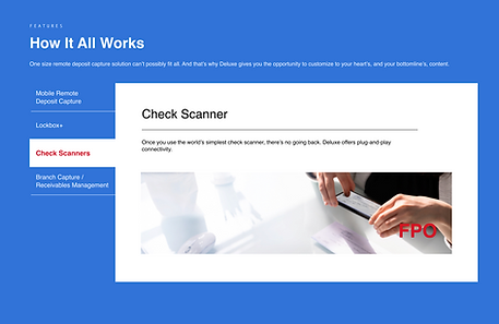
When asked about the overall takeaway from the Deluxe+ logo we found the reception was very inconsistent.
Key Takeaways
Exploring different treatments of the Deluxe+ rebrand since there wasnt too much of a connection between the logo, and color treatment on the receivables suite and product page.
The End Result
Overall, our goals were achieved in the validation of these web page designs users felt that:
-
Our designs were validated. Most users understood the aesthetic and messaging of what Deluxe can offer
-
Users comprehended what the services were of the home page and product page, witht he receivables page still needing some work and exploration
-
All users formed accurate expectations when asked about CTA link interactions on web pages
-
The content flow & hierarchy on all 3 pages is generally working well, while there is still room for improvement for the receivables page.


In Conclusion,
User Testing does NOT Equal Finite Design Choices
What I learned from this user test is that user testing =/= finite design decisions. From gaining insights from a broad, executive view on the validation of these design pages, we were ultimately able to come from the findings with an idea of how we wanted to approach further design decisions with Deluxe. This user test showcases that the design process is a part of a broader and more iterative concept that requires more time and effort to come to an ideal design decision.

