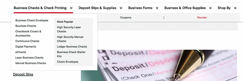
“Who is Deluxe?”-Defining Brand through Navigation.
Deluxe is a fortune 500 company that is well-known for their check ordering services. As of recently, the company has undergone a rebrand. The company has been striving to not just offer check services but also provide payment, data, and marketing solutions as well.

The Challenge.
The challenge, however, was trying to rebrand Deluxe as a one-stop shop for all things marketing, data, and payment. Their major pain points started at the navigation, where users found trouble weeding through the site’s tabs in order to understand the company’s services. Our goal was to re-design an experience, starting with the navigation, that could provide clarity on who Deluxe is as a company and what services they offer.


My Role.
I was responsible for:
-
supporting phase 1 of user testing that would help with the redesigned navigation experience
-
conducting phase 2 of user testing for the re-designed navigation experience wireframes. I also
-
supporting the UX lead findings delivery to the stakeholders.
I worked as a UX Researcher with a Lead UX Designer, a UI Designer, a product Manager, and Creative Director.
Constraints.
With the nature of taking on a new client, we discovered that Deluxe’s creative team was very literal. We had to figure out proper alignment with their perception of our user test findings while convincing them with the importance of user testing.
Another constraint included the tight turnaround period for extensive testing. Since Deluxe was planning on developing the entire website experience in under 5 months, we had a tight turnaround for delivering findings for a user test that would require thorough research and planning.
Process.
The process for the navigation experience redesign was as followed:
Ideations
Our UX Lead created initial wireframes of the navigation experience.
Usability Testing and Synthesizing
I supported our UX Lead in proctoring the user testing through note taking and synthesizing.
Wireframe Redesigns
Our UX Lead redesigned wireframes based off of the findings discovered during the user tests.
Secondary Usability Testing
I lead the secondary set of usability testing based off of the new designed versions of the wireframes our UX Lead created.
Ideations
A Crowded Experience
To flesh out the brand of Deluxe our stakeholder’s felt it would be best to redesign a new navigation experience. The current navigation on the website was crowded and failed to represent the services they had and the brand that they are.
Some of the biggest challenges to successfully showcase the checks, payment, and solutions services Deluxe had offered through the navigation experience alone.


Preferences
When asking users which prototype they preferred it was dead even. Comparison between both versions held more precedence, than which version was better.
Version C

Version C was favored because of placement of ecomm drop downs, cleaner, friendlier, and more user friendly experience.
Version D

Users favored Version D because they felt that the ability to search and understand the company services was easier. Users enjoyed a more detailed solutions menu.
The Wireframes
Our UX Lead re-designed and prototyped the navigation experience with a first round of wireframes. In order to explore the validation of different navigation treatments, 2 versions of the experience were made

Version A

Version B
Usability Testing and Synthesizing
From here, our team decided to conduct a moderated user test based off of the 2 new Deluxe navigation wireframes. We decided on moderated user testing to evaluate the following:
-
If our navigation design experience showcased Deluxe’s audience
-
If Deluxe’s services and solutions were understandable to their users.
-
Which navigation experience, features, or details were well received by participants.
The Findings
After conducting our first round of user testing on both navigation wireframes, we had discovered the following takeaways
about the navigation:
Simplify: we wanted to simplify the navigation experience by avoiding any nested tabs, dense content within categories, and differentiation.


Explain: We wanted to keep our insights/about us section to explain what Dlx does, we felt this would be best by keeping 2 categories combined.
Design: making sure the design was clear and understandable especially with spacing, and brainstorming different design solutions.

***At this stage of user testing, I was responsible for crafting the test plan, and providing support to our UX Lead by taking notes and brainstorming findings.
Wireframe Redesign
After synthesizing our results from the initial user testing, our UX lead
re-designed and prototyped 2 new navigation experiences with a second round of wireframes.

Version C

Version D
Secondary User Testing
Back to the
Drawing Board
After our first round of testing, we felt that it would be best to facilitate a second round of testing. We did this to further flesh out the design experience for the navigation.
At this stage, I was not only responsible for this round of testing but also for allocating findings as well. Our UX Lead stepped in as support, taking notes for the tests I facilitated.
Since we wanted to get a clear understanding on what users were experiencing with our newly wireframed navigation experience, we felt it would be best to conduct moderated user testing.


Planning the Execution.


We screened for users that were:
- US Residents
- Age 18-65
- Had a minimum college education
- Had relevant career fields in business and financial operations, human resources and administrative support conditions, and Management occupations
*We decided on testing roughly 5 users for each version, totaling 10 users.
The Screening
The Goals
The goals were as followed:
-
General Impression & Expectations: Evaluate top level labels
-
Key Use Cases: Evaluate architecture & pathways
-
Open Exploration & Feedback: Opportunity for additional thoughts on design & Structure
-
Brand Perception: Evaluate whether participants understand what Dlx does
-
Comparison: Allow participants to offer feedback & preference on the other version
The Findings
We discovered some interesting information on our second round of wireframe designs. Our Findings were as followed:
Who is Deluxe?
While going through our second round of user testing, we wanted to make sure our designs validated who deluxe was as a brand. During testing, we asked users “What does Deluxe Do?”. Asking this question would lead us into the right direction of what type of brand we wanted the company to represented as.
Most descriptions for Deluxe were accurate to parts of the company’s overall offerings. This was good, it means that we are moving in the right direction of Dlx’s branding.
5 participants understood that Deluxe provided both payment and marketing solutions.


1 participant mentioned that their initial impressions of Deluxe was offering print services before investigating the site and finding it geared more towards payment and solutions.
3 participants acknowledged that Deluxe offered checks and promotional products
1 participant felt like the site was a payment and banking platform. Could be due to the copy used in the “Help me to/ ‘Solutions’” tab

Preferences
When asking users which prototype they preferred it was even. Comparison between both versions held more precedence, than which version was better.
Version C

Version C was favored because of placement of ecommerce drop downs. It had a cleaner, friendlier, and more user friendly experience.
Version D

Users favored Version D because they felt that the ability to search and understand the company services was easier. Users enjoyed a more detailed solutions menu.
Help me to/Solutions


There should be more links within section related to checks and promo use-cases. Therefore, we could change links within tab to differentiate between payment options OR condense them into fewer payment related links.
Consider solutions menu in global navigation
Who we Serve

Consider using the expanded layout with sub-categories in Version C.
Checks and
Promotional Services

Use less central placement of Version D to keep checks and promo less prominent in main navigation
If using the drop-down menu for promotional products, consider adding a general “shop-all” link
Recommended Approach:
-
Recommended Approach: Consider incorporating the expanded “Who we serve” Menu from Version C into the overall framework of Version D
Final Takeaways
From my findings, I discovered that while users understood the overall Dlx brand and it’s services, more than half of the users still could not pinpoint all the services Deluxe provides. Since this was a collaborative learning effort my team and I knew that further testing would be needed to validate not just Deluxe as a brand but to also gain full understanding of what Deluxe can offer its users.
What I Learned,
There was so much to learn from this extensive user testing of the navigation experience. As a UX Designer, here are the 2 key concepts that I learned:
Iterative Testing
User testing multiple versions of the same design experience, can provide more clarity in what you are trying to design than facilitating just 1 user test. The point of user testing is to allocate findings that will guide one into the right direction of what design choices should be made. And at times, this cannot be done with just 1 user test, but with multiple.
Specifics Matter
With Iterative user testing, users won't always prefer certain versions over others. Sometimes looking into the specific features and elements of versions are more useful than trying to pinpoint which version of a design did better than the other.
Next Steps
Our next steps were to hand off to creative for high fidelity UI designs, and user test the newly designed webpages.

Design Validation
From here, we handed off our navigation designs and wireframed webpages (designed by our UX Lead) to the creative team. The creative team was able to produce 3 newly designed webpages with the new navigation experience.
The goal of these webpages was to further cement Deluxe as a brand along with the services that they provided through aesthetics, color, visual imagery, and descriptive copy.
Our next steps were to user test the newly designed web-pages along with the navigation experience to ensure further clarity of the Dlx Company

